Moodee Studio is a multidisciplinary creative agency specializing in brand strategy, brand identity, and website design for founders ready to elevate how their business is perceived online.
Brand & Web Design done in house.
Learn how strategic therapist website design, branding, copy, and SEO can create a more human, trustworthy online experience for therapy clients.
Web Design
Your therapist website shouldn't feel like a hospital waiting room.
You know the kind. Soft beige background. Random photo of a woman staring thoughtfully out a window. A paragraph full of clinical language that technically says a lot but somehow tells the person reading it absolutely nothing about whether they'll feel understood.
And listen, there's nothing wrong with calm colors or polished design. But when every therapist website starts using the same visual language, the same vague messaging, and the same stock photos, it gets really hard for a practice to feel like an actual person is behind it.
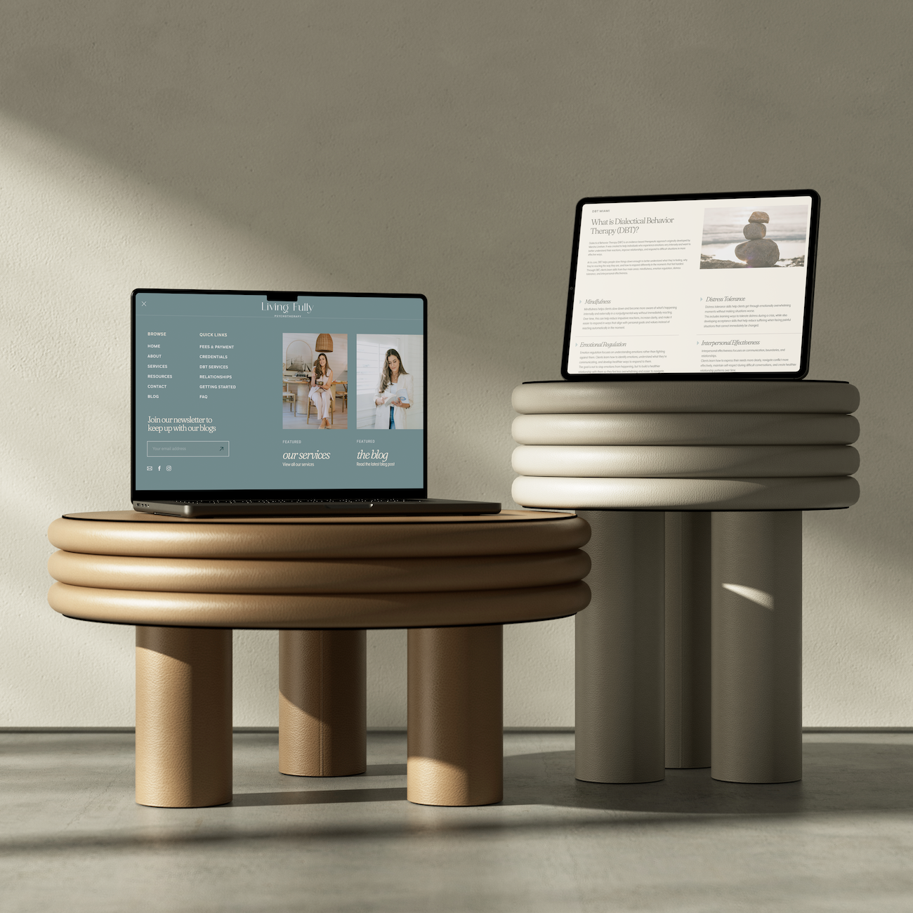
That's exactly what we wanted to avoid with Living Fully Psychotherapy.
The goal was to create a brand and website that could hold two things at once: emotional depth and a sense of control. It needed to feel calm without becoming sterile, supportive without becoming overly soft, and polished without losing the realism of why someone might be searching for a therapist in the first place.
Because someone looking for therapy probably isn't thinking, "I'd love to explore my emotional regulation through a DBT-informed clinical framework."
They're thinking, "Why do I keep reacting like this?" Or, "Why does everything feel so overwhelming?" Or maybe just, "I know something needs to change, but I don't know where to start."
A good therapist website needs to meet them there.
Before choosing colors, fonts, layouts, or animations, I want to know what needs to happen emotionally when someone lands on the website.
Do they need to feel calmer? Less judged? More understood? More confident that this person can actually help them?
For Living Fully Psychotherapy, the answer was clear. The website needed to create a sense of steadiness without pretending difficult emotions are neat, simple, or easy to fix.
That's where the balance came in.
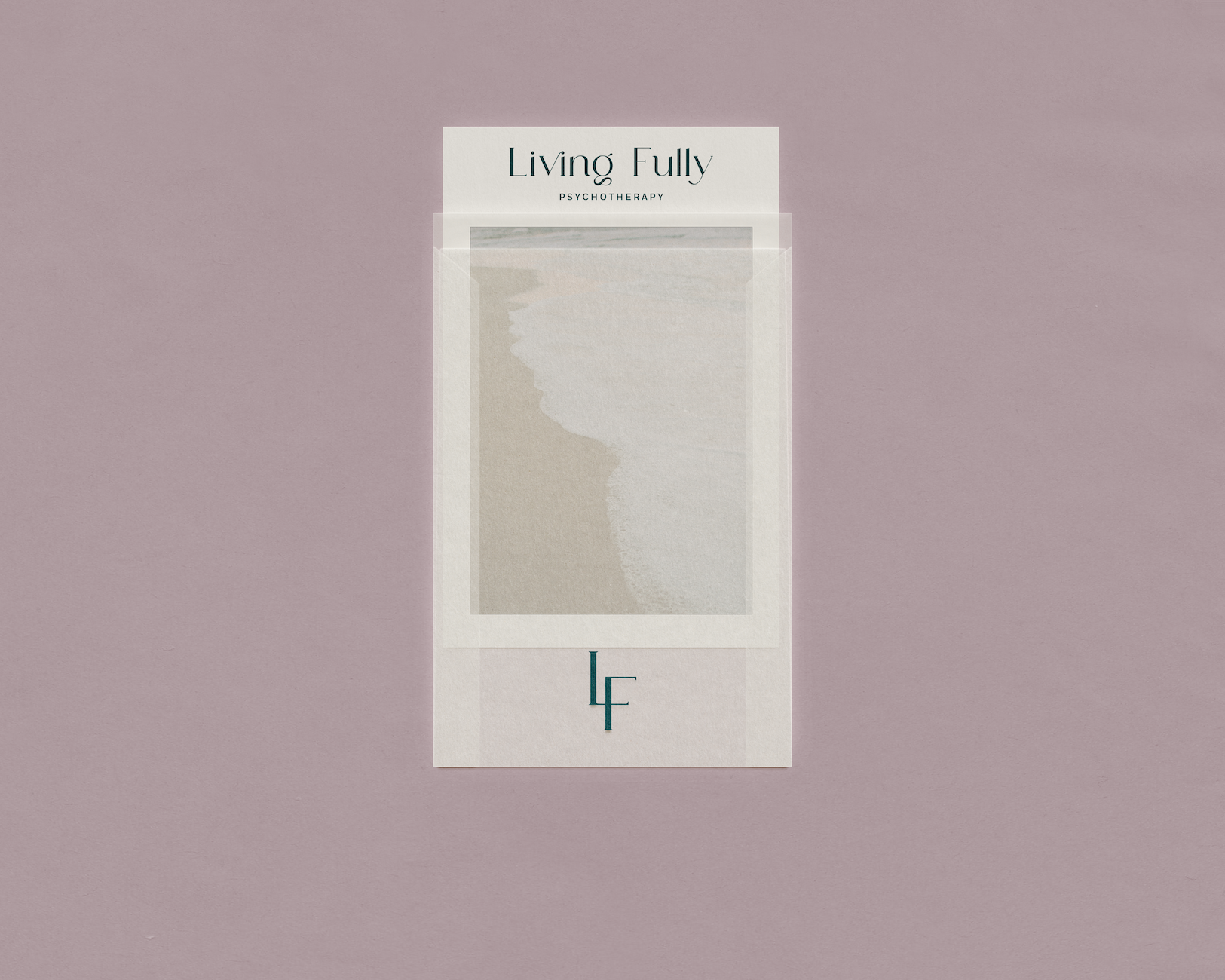
The softer colors and natural imagery helped create calm, while the deeper teal, stronger typography, and more editorial layouts gave the brand structure and confidence. It didn't feel overly clinical, but it also didn't drift into the overly delicate, whispery look that a lot of therapy practices fall into.
The goal wasn't to make therapy look pretty.
The goal was to make the practice feel human, grounded, and clear.
This is also why branding matters before website design. When the visual identity, tone, creative direction, and positioning are already working together, the website has a much stronger foundation to build from.

This is where so many therapy websites lose me.
The copy is technically correct, but it sounds like it was written for another clinician instead of the person who is actually looking for help.
A potential client usually isn't searching for a long explanation of modalities first. They're trying to figure out whether you understand what they're experiencing, whether they'll feel safe talking to you, and whether taking the next step feels manageable.
For Living Fully Psychotherapy, the copy needed to sound direct, compassionate, and grounded in real life.
Instead of hiding behind vague phrases, the website speaks directly to experiences like feeling overwhelmed by intense emotions, reacting quickly and later regretting it, shutting down during difficult conversations, or getting stuck in the same relationship patterns.
That's the difference between telling someone what you do and helping them recognize themselves in the problem.
And that recognition matters.
Because when someone lands on a website and thinks, "Okay, this person gets it," you've already made the experience feel less intimidating.
The same applies outside the therapy industry, by the way. Your website copy should sound like how your audience actually thinks and talks, not how your industry describes them in a strategy document.
Read this next: Why Your Website Isn't Selling For You
A website can feel beautiful, warm, and thoughtful and still make people work way too hard to understand what to do next.
That's not the goal.
For a therapist website, the path needs to feel incredibly clear. Who do you help? What services do you offer? Where are you located? Do you offer virtual sessions? What happens during a consultation? What does therapy cost? How does someone get started?
People shouldn't have to open six tabs and perform a small investigation to answer those questions.
For Living Fully Psychotherapy, we made sure the website clearly explained the services, process, fees, FAQs, and next steps. The main call-to-action stayed consistent throughout so someone always knew how to move forward when they were ready.
That kind of clarity is part of good user experience.
Google also emphasizes creating useful, people-first content that helps visitors accomplish what they came to do, which is exactly why clear structure and useful information matter for both humans and search visibility.
And from a UX perspective, people shouldn't have to think too hard about where to go next. Clear navigation, scannable content, and an obvious path through the site reduce friction and make the experience easier to use.
Let's talk about the awkward part.
SEO copy has a reputation for sounding terrible because, historically, a lot of it has been terrible.
You know the kind: "Looking for a therapist in Miami, Florida? Our Miami therapist offers therapy in Miami for people seeking Miami therapy."
Please don't do that.
SEO should help the right people find you without making the website sound like it was written for a robot.
For Living Fully Psychotherapy, the SEO strategy was built around the actual services, specialties, and geographic areas the practice serves. That included phrases related to DBT-informed therapy, emotional regulation, anxiety, relationship challenges, therapist website content, and location-based terms for Doral, Miami, and Florida.
But those keywords were worked into the copy naturally.
The reader still comes first.
That matters because the strongest therapist website SEO strategy is not just about inserting keywords. It's about creating genuinely useful pages that clearly answer what people are looking for, while making it easy for search engines to understand who you help, what you offer, and where you're located.
That means your therapist website should have clear page titles, useful headings, service-specific content, location information, FAQs, internal links, and copy that actually matches the questions your ideal clients are searching.
Pretty website. Smart structure. Real words. All working together.
That's the sweet spot.
This is the part I care about most.
The brand shouldn't look one way and the website feel like something completely different. The visuals, copy, user experience, and overall tone should feel like they came from the same brain.
For Living Fully Psychotherapy, the visual identity created the emotional direction. The copy gave that direction a voice. The website brought the whole thing together into an experience someone could actually move through.
That's why I don't see brand strategy, therapist branding, website design, website copy, and SEO as completely separate problems.
They all shape the same first impression.
And when they work together, the business becomes easier to understand, easier to trust, and easier to remember.
This is exactly what my Full Haus offer is built for. It's the full brand and website experience, including brand strategy, creative direction, visual identity, website strategy, custom website design, and development.
Read this next: Your Business Has Outgrown the Way It Shows Up Online
A good therapist website should feel like a natural extension of the person and practice behind it.
It should help the right client recognize themselves in the problem without making them feel judged. It should explain the services clearly, make the process feel approachable, and give people enough information to decide whether reaching out feels right for them.
It also needs to work strategically.
That means strong therapist branding, thoughtful website copy, clear calls-to-action, intentional user experience, useful SEO content, and a design system that can carry across every touchpoint.
Not because every website needs to be complicated.
Because every piece should know what job it's there to do.
Your website doesn't need to look like every other practice in your industry to feel credible.
It can be warm without being generic. Professional without being cold. Calm without disappearing into a sea of beige.
And most importantly, it can help the right people understand who you are, what you do, and whether you're the person they've been looking for.
If your brand and website need to be rebuilt together, the Full Haus is where we handle the whole thing from strategy through design and development.
If your brand is already strong and you only need a custom website, website projects are available separately too.